
In a previous post, we discussed the U.S. Cost of Living Index (COLI) data for the second quarter of 2012, with particular interest in the Atlanta and Seattle markets. Recently, we have received the annual 2012 COLI results produced by the Council for Community and Economic Research (C2ER). Greenfield Advisors’ Director of Economic Research, Dr. Cliff Lipscomb, serves on the National Advisory Board for the Cost of Living Index. To explore pricing changes in the year 2012 across the nation, we decided to compare the top 10 most populated metropolitan areas in the United States.[1] We have added Seattle to this list because it is named one of the fastest growing metropolitan areas, and it is also where Greenfield Advisors is headquartered.
How the Cost of Living Index Works
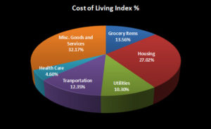
First of all, let’s talk about the index itself. The COLI is designed to measure differences in the prices of consumer goods and services (excluding taxes) across regions. How does C2ER measure these differences? They collect pricing data three times per year from each of the cities participating through their respective economic development organizations, chambers of commerce, or university economic centers. In 2012, 307 urban areas participated in providing C2ER pricing information on 60 different items. This resulted in over 50,000 prices for the various items that can be categorized by sector. The six sectors outlined in the pie chart below make up the overall composite index, and the percentages reported indicate the weight each sector has on the aggregate index. The degree to which each item contributes to the index’s composite of values is determined by the distribution of consumer expenditures among the sectors.
Comparison of the Most Populated Cities
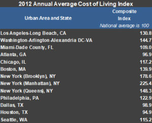
Now, we’ll compare the aggregate (or composite) COLI scores for the most populated areas. New York’s urban neighborhoods (Manhattan, Brooklyn, and Queens) make up three distinct areas. Rather than averaging those to derive a single index score for New York City, we left each area distinct so you are actually seeing 13 metropolitan areas included in our overview. One important aspect of the COLI is that all values are compared to a benchmark value of 100. In other words, 100 is the average aggregate index value where the national average cost of living equals a composite score of 100. An index score below 100 indicates that the cost of living in a given area is below the national average, while a score above 100 indicates that the cost of living in the area is higher than the national average.
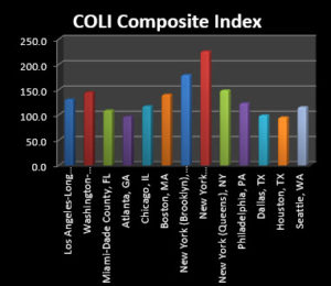
With that in mind, when we look at the aggregate (or composite) index, we see that many of the nation’s most populated cities have a cost of living that is higher than the national average. Though it is not surprising that Manhattan has a higher cost of living than Queens and Brooklyn, we felt that the vastly different prices within such close proximity to one another were quite interesting to see on paper. The index scores show that the cost to live in New York is over two times the national average in Manhattan, almost twice the national average in Brooklyn, and one and a half times the national average in Queens. In contrast, the cost to live in Atlanta, Georgia; Dallas, Texas; and Houston, Texas; are all below the national average.
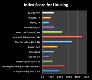
The Housing Sector
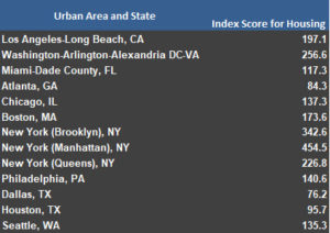
Since we have a keen interest in real estate, we thought it would also be fun to hone in on the housing sector, which in 2012 made up 27.02% of the composite index. Again, we see that Atlanta, Dallas, and Houston are cities where housing prices are below the national average. We also see that it costs roughly the same amount to live in Chicago, Philadelphia, and Seattle, with index values between 1.35 and 1.40 times the national average. Not surprisingly, Manhattan is the most expensive city to purchase housing, with an index value that is over 4.5 times the national average. The Brooklyn neighborhood of New York City also has higher than average housing prices at nearly 3.5 times the national average. In Washington D.C. and the New York-Queens area, housing cost well over 2 times the national average, with Los Angeles, California, not far behind with an average cost of housing that is 1.97 times the national average.
As you can see, the COLI provides a variety of interesting data. We look forward to its publication, and seeing how prices change from year to year, and quarter to quarter. If you are ever relocating, it is also a great planning tool, as it provides the overall cost of living ranking for the primary expenses that one typically incurs, and even breaks these costs down by sector. Further, it ranks these sectors, so it’s easy to do a quick comparison from locale to locale.
– Abigail Mooney and Sarah J. Kilpatrick


Recent Comments