
At Greenfield Advisors we follow a variety of journals, both real estate and economic, and we also review various indices. One index we find quite interesting is the Cost of Living Index produced by the Council for Community and Economic Research (C2ER), a nonprofit organization. Dr. Cliff Lipscomb, Director of Economic Research at Greenfield Advisors, serves on the National Advisory Board for the Cost of Living Index, which is a reliable source for comparing prices of consumer goods and services in more than 300 U.S. cities.
C2ER recently released the second quarter 2012 results. Table 1 presents their list of the most expensive and least expensive urban areas in which to live in the United States. In Table 2, we provide data for the most expensive and least expensive areas to purchase groceries.
Table 1. The 10 Most and Least Expensive Urban Areas in the Cost of Living Index
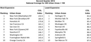
(Source: The Council for Community and Economic Research Cost of Living Index, Media Release 2Q2012.)
Table 2. The 5 Most and Least Expensive Places for Grocery Items by Index Number in the Cost of Living Index
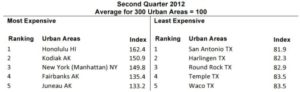
(Source: The Council for Community and Economic Research Cost of Living Index, Media Release 2Q2012.)
To demonstrate the range of data that C2ER researches, in Table 3 we present the cost of living adjustments for someone living in Seattle, Washington, who decides to relocate to Atlanta, Georgia. Greenfield Advisors has offices in both cities, so we thought this would be a nice example of how an employee changing office locations would see cost shifts in various areas of spending. If you want more detailed analyses beyond the basics presented here, C2ER will run these calculations, as well as others, for a small fee or on a subscription basis.
First, we start with a base salary of $45,000 after taxes; an equivalent salary in Atlanta would be approximately $38,130 after taxes. From Table 3 one can see that the most significant difference in moving from Seattle to Atlanta is the decrease in the price of housing (-33.60%), followed by a decrease in healthcare (-14.30%), groceries ( 4.25%), and transportation (-4.21%), while utility expenses would typically increase (+5.19%).
In Table 4, we provide C2ER’s average price data for a common basket of goods and services in Seattle and Atlanta; this table provides the national averages as well. Notice that “Total Energy” is one of the few items where a former Seattle resident is likely to see cost increases. Meats, potatoes, and alcohol are also typically cheaper in Seattle than in Atlanta. Similar to energy costs, some grocery items may have lower prices in Seattle because of its location. For example, Washington State is located directly adjacent to the state of Idaho, which is the nation’s largest producer of potatoes. Thus, shipping costs for a bag of potatoes are likely to be less expensive in Seattle, and the lower production costs are reflected in the item’s price. However, note that Atlanta has cheaper peaches; then again, it is “The Peach State.” These data help demonstrate, among a variety of goods and services, where price differences come into play. We always enjoy seeing these updates, and we thought you might too.
Table 3. Cost of Living Adjustments for Someone Relocating from Seattle, Washington, to Atlanta, Georgia
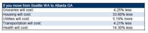
(Source: The Council for Community and Economic Research 2012 Cost of Living Index Calculator)
Table 4. Average Price Data for a Common Basket of Goods and Services
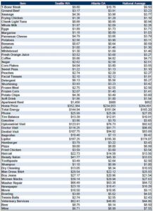
Source: The Council for Community and Economic Research 2012 Cost of Living Index Calculator.


Recent Comments